
Kwality Cocoa Powder
The original packaging was chaotic, cluttered, and lost on store shelves. Despite being a quality product, its presentation wasn’t cutting it. The challenge? Turning the confusion into clarity and standing out in a saturated market while appealing to a younger, trend-focused audience.
Packaging Redesign:
Clutter Out, Cool In
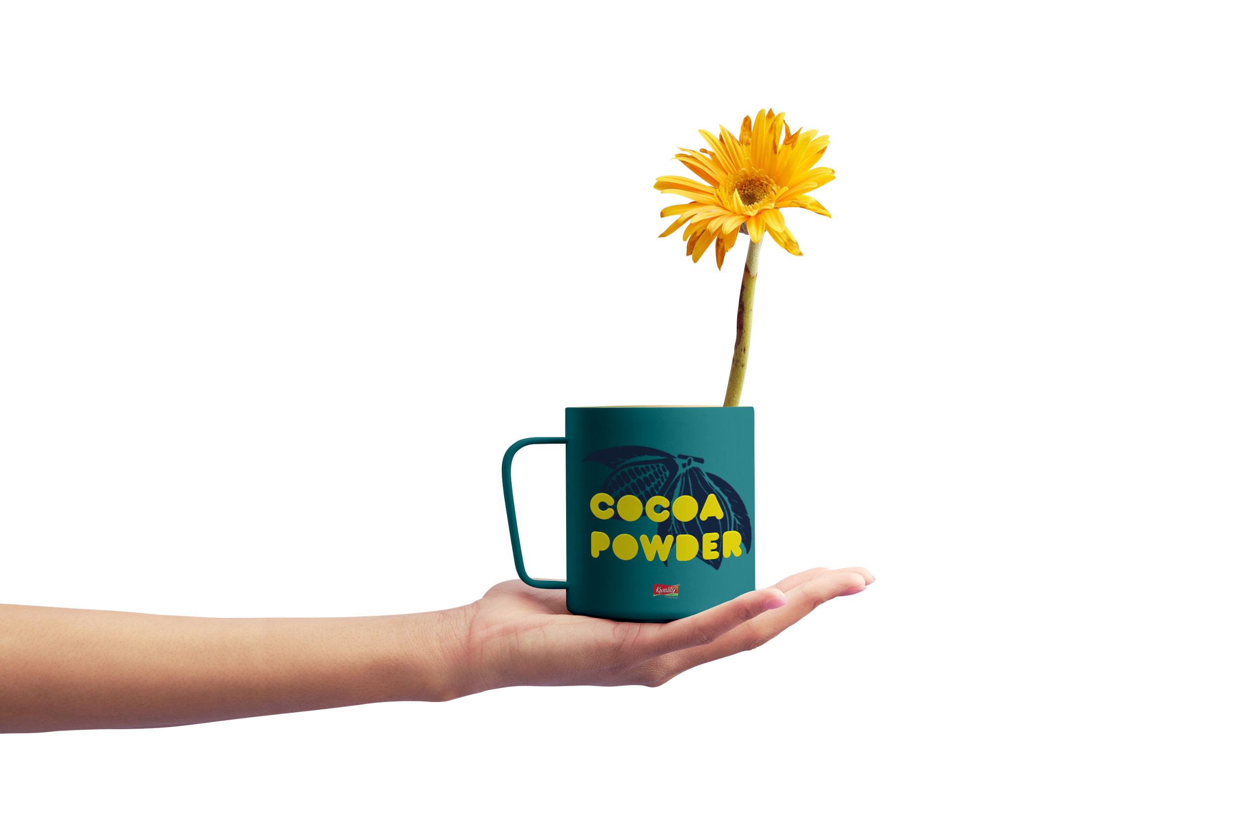
By simplifying the visual elements, we created a design that’s sharp and direct, stripping away the noise. The new packaging now features bright colors, bold typography, and a cohesive brand identity that extends to other merchandise, such as branded cocoa cups. The goal? Make the product pop without overwhelming the consumer.
Bold Colors,
Big Typography
By using a loud mix of bold, contrasting colors and big, unapologetic typography (Baruta and Century Gothic), the packaging was transformed into something that demands attention.
Target Audience:
The Comfort Seekers
This cocoa powder is for those who think life’s too short for boring drinks. Rainy days, cozy blankets, and warm, chocolatey comfort — minus the guilt trip. Perfect for avoiding responsibilities, binge-watching, and daydreaming about canceling plans.