
Gladno.mi e
A community of hungry people.
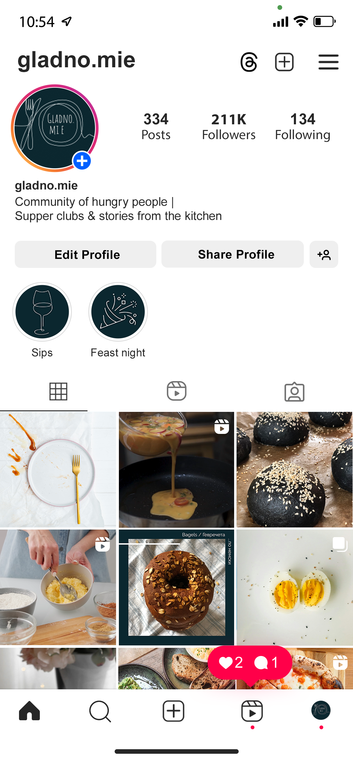
gladno.mi e (Bulgarian for “I am hungry”) is more than just a name - it’s an invitation. Built around the love of food and connection, the brand brings people together through supper clubs and shared recipes, capturing offline experiences and preserving them online. Every recipe and every memory made at these gatherings is documented on Instagram, turning the platform into a living archive of flavors and moments.
GLADNO MI E
GLADNO MI E
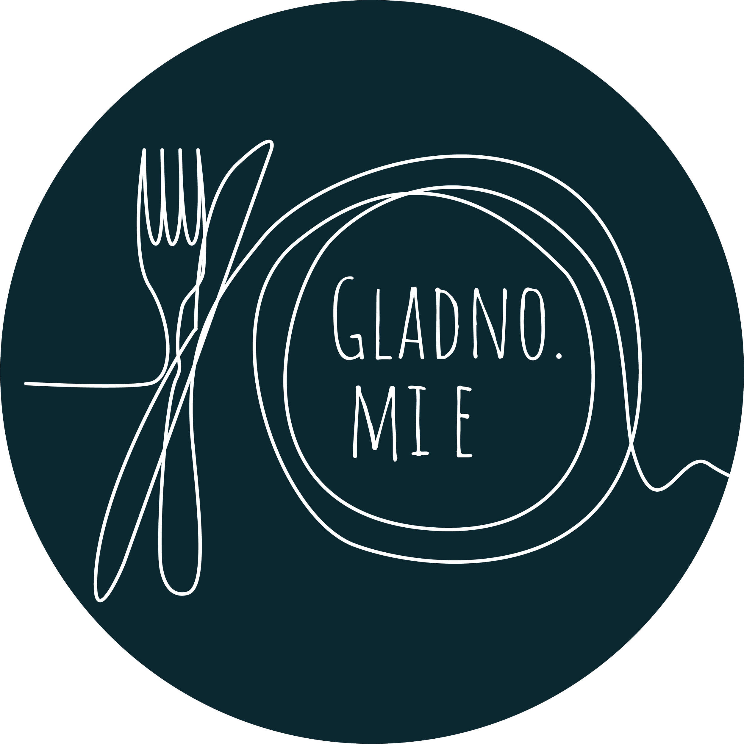
The logo is a refined line art illustration, keeping things simple yet distinctive. Designed to feel hand-drawn but intentional, it embodies the organic, unfiltered nature of food and community. The animation extends this idea, adding movement and life to the brand.
The Aesthetic – A Visual Language for Food
To create instant recognition, gladno.mie follows a distinct dual-tone aesthetic:
Dark & moody for cooking recipes – deep shadows, rich tones, and an intimate atmosphere.
Light & bright for baking – soft hues, airy backdrops, and a fresh, inviting feel.
This contrast enhances storytelling and subtly guides the viewer’s expectations. The platform acts as the brand’s dynamic hub, where:
Supper club events are announced.
The visual identity unfolds through curated images and videos.
The animated logo reinforces branding, seamlessly appearing at the end of videos.
Branded Outro Animation
The outro stays true to the brand’s raw and organic nature. The animation follows a single-stroke motion, mirroring the fluidity of handwriting and reinforcing the handcrafted essence of the logo itself. The composition is deliberately simple - letting the movement speak for itself, ensuring a clean yet memorable sign-off.
Gladno.mie
real people, real food, real conversations