
Porridge Oats Website: UI/UX
I refined the Porridge Oats platform with a mix of smart design and seamless navigation. The result is a user-friendly experience that effortlessly guides customers from craving oats to checkout.
The Challenge
After conducting a user persona analysis, I identified that the Porridge Oats website was not meeting the needs of its audience. Most users accessed the site via mobile devices, yet the lack of a dedicated mobile version made navigation clunky and frustrating. On desktop, while the structure was cohesive and easy to navigate, it felt outdated, and the site map needed an update to better align with user behavior and expectations. These gaps created a disconnect between the brand’s vibrant identity and the user experience.

The Road to Redesign
A user-centered design approach guided the process, involving research, wireframing, and prototyping to ensure a better user experience.
User Personas: Defined key audience profiles.
Site Map: Mapped out site structure for better navigation.
Existing Website Review: Identified areas for improvement.
Wireframes: Created basic layouts to plan site elements.
Figma Designs: Developed high-fidelity designs.
Mobile Version: Focused on a mobile-first approach.
Desktop Version: Adapted design for desktop consistency.

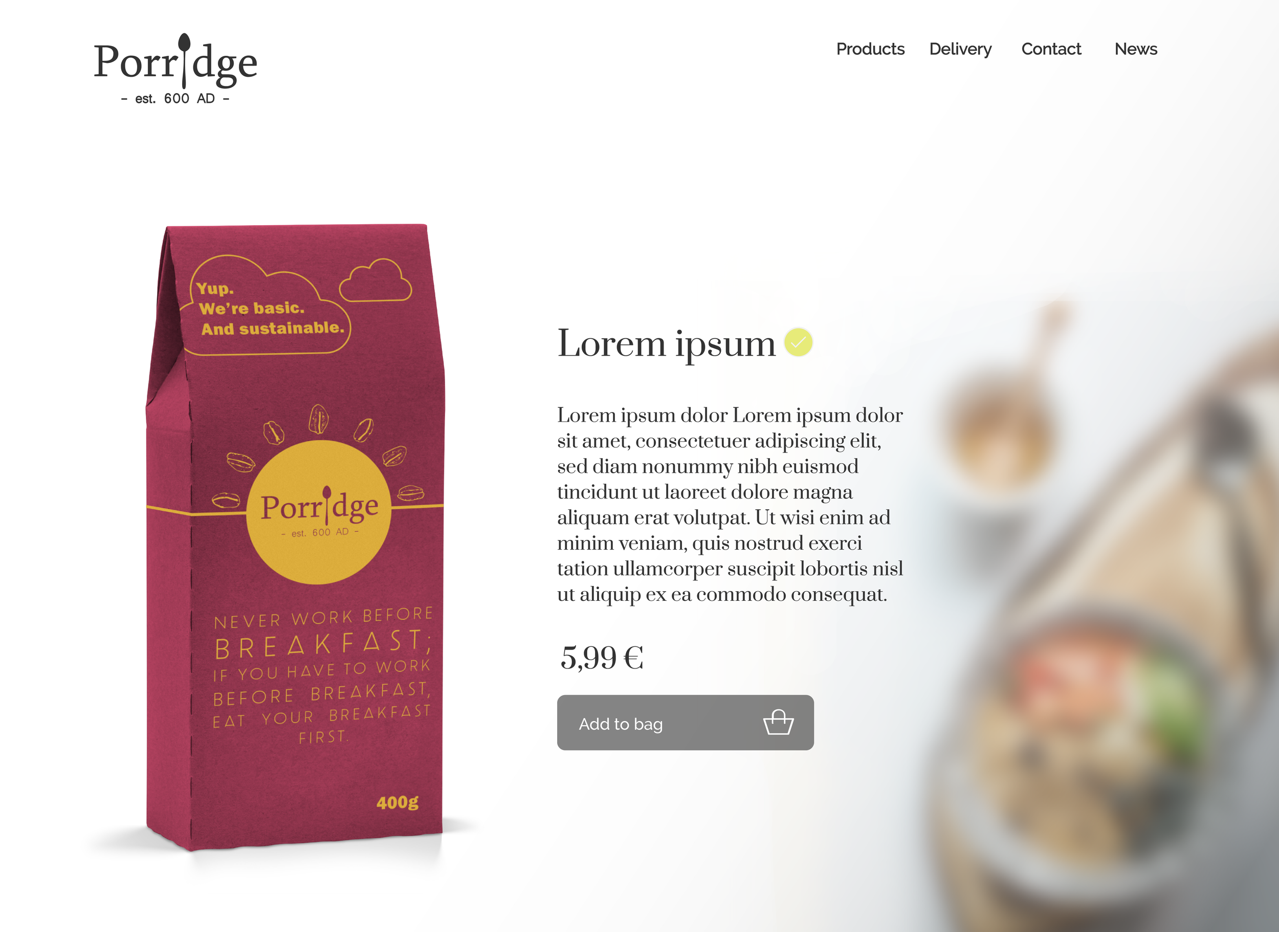
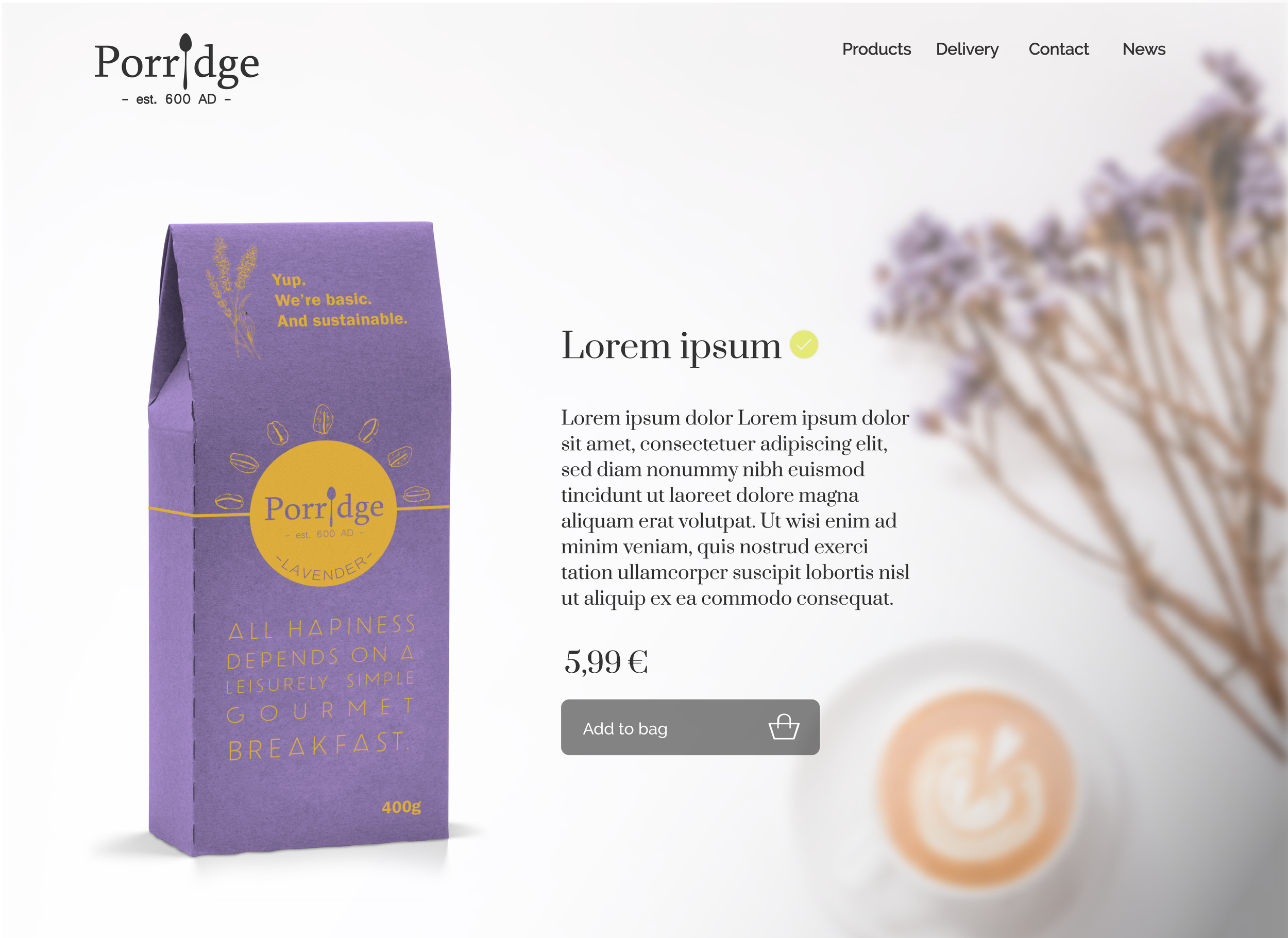
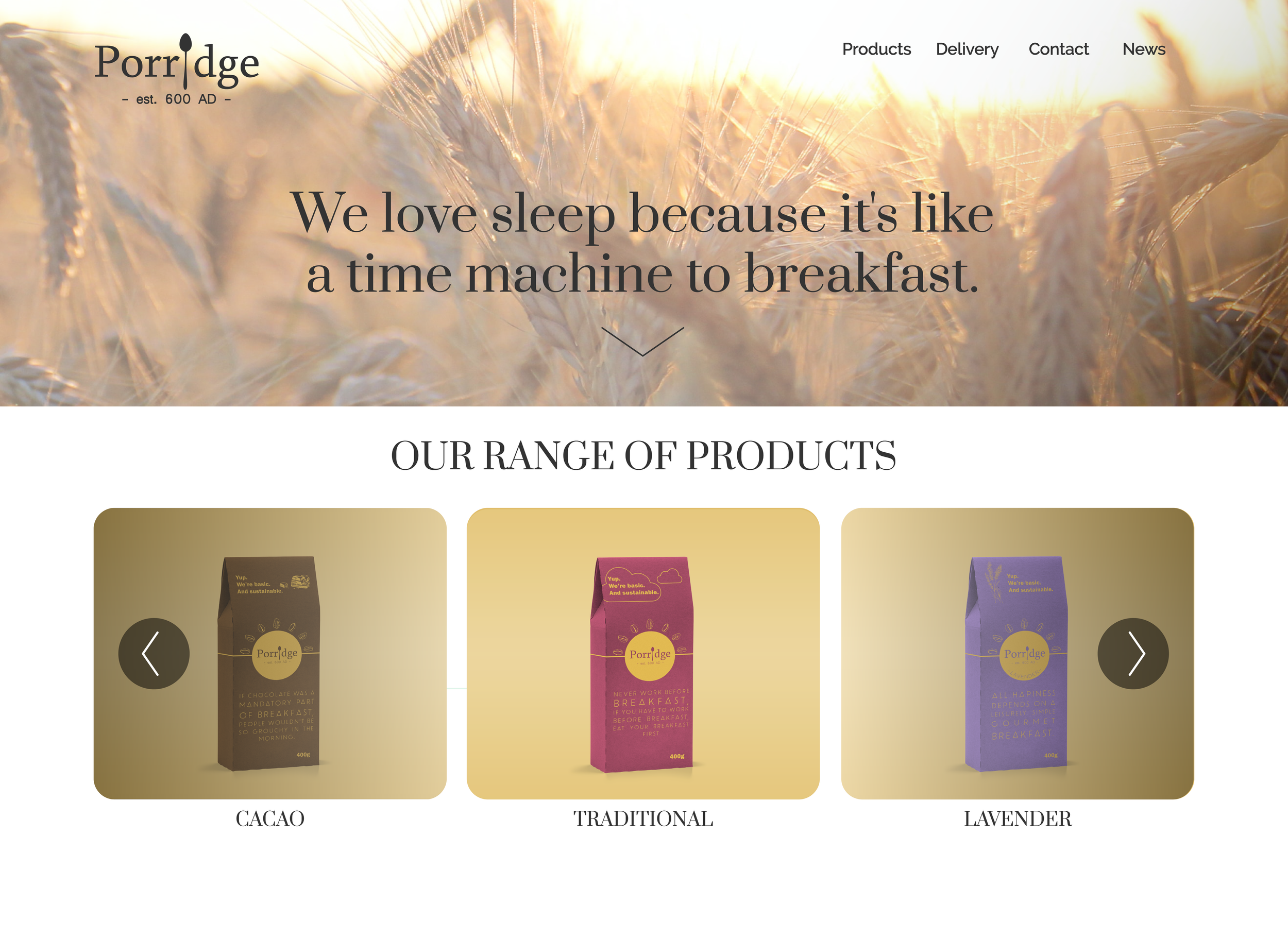
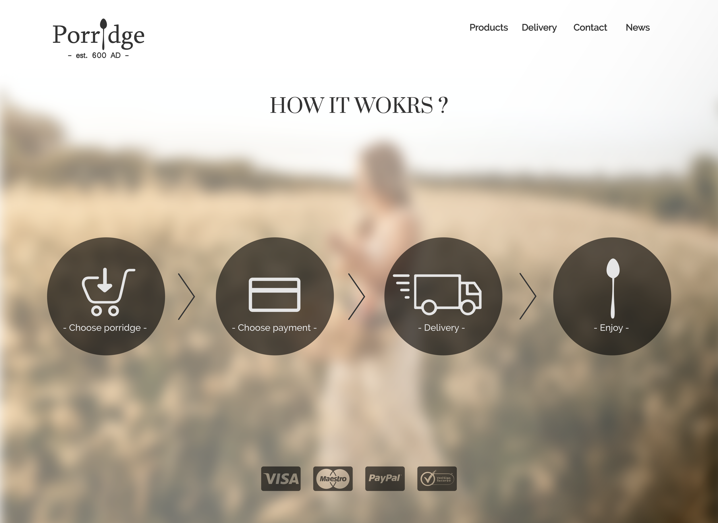
What’s New?
Enhanced visuals that compliments the playful brand identity.
Improved structure and accessibility for a more intuitive user journey.
A refreshed layout that fosters trust and encourages exploration.